Atomic Structure In React Native
Why would to use Atomic structure?
Let’s say a developer has a list of buttons used for the application , all in black background and white title color. They haven’t worked in the application in a while and need to come back to the application to add a new button with progress. They could take a look at the buttons that already exist and customize one of them to get the result they desire or created new progress button. Also, decreases the inconsistency between component and view, repeated code and lack of style-guide component .
Features
- Atomic design breaking down user interfaces into small and simple element.
- Improve consistency and complexity between components and view.
- Code is reuseable.
- Improve the readability, scalability and flexibility of your application code.
- Reduces development time.
Structure
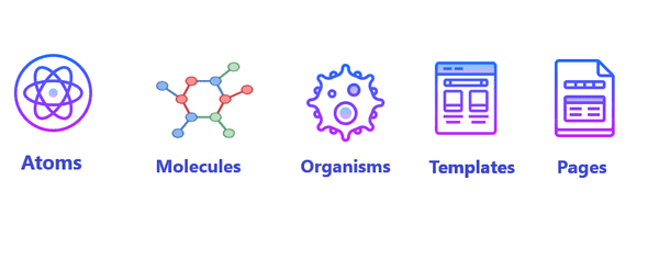
Atoms : Atoms is the smallest component . Which is used by context,globally or withine other components and in templates . Every components having many states. So easy to use for development.
Example:- Button is the single component having different states or options like size,enable or disable,haver,pressEvents etc.
Molecules : Molecules creates functionality using atoms and have own properties. Molecules is the combination of two or more atoms. Which don’t have any action or functionality by themselves. Reuse some of those component or begin to compose complex component.
Organisms : Organisms are the combination of molecules that works together or even single atoms composed to elabrate interface. Organisms is the most of final shape of component to use . They are independent,reuseable,poratable in any content.
Templates : Templates is becomes using the context of component . Templates create relationship between organisms and other components through the various components placement, set the positions and patterns of the pages.
Pages : Pages are the navigate part in the application. Where the components are distributed in one template. Need to connect more than one templates. In this stage need to check efficiency of the design system to analyze all component are independent enough or need to split them in smaller element (part).
File Structure: Here is the file structure of Atomic Design.
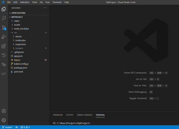
Created new src folder and atoms,molecules,organisms, screens are under the src folder. Screens is used instead of template and pages. If you would be use other element then can be split it in different component . If need to use navigation in project then create different folder for navigation and create navigation javascript file like StackNavigation.js, DrawerNavigation.js,BottomNavigation.js etc. So,code is reusable and very compatible for developer.
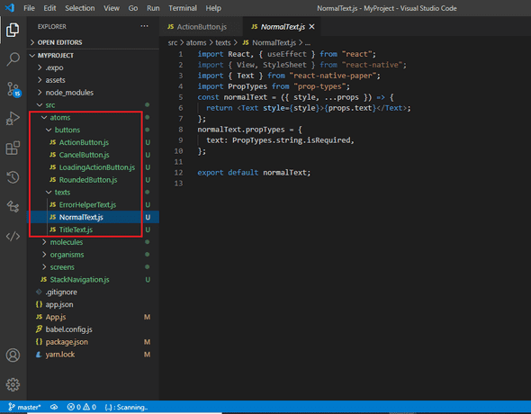
In the above project created ActionButton.js and other various button files in button folder and NormalText.js and other required text file for project created in text folder . Here can compose different component in atoms as per requirement of project. Also,apply style ,actions,states inline or using global context .
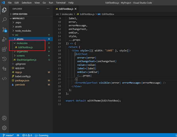
In molecules created EditTextBox.js file . To set the label for editTextBox used NormalText.js file from atoms .Used different states and global context. They have own set of action,style and integration of unit is independent in application. So that reducess developer efforts and easy to test code consistently and effectively.
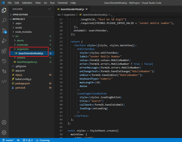
Organism folder contains combination of molecules and atoms . In above project create SearchSenderModel.js file by combination of EditTextBox.js from molecules and LoadingActionButton.js from atoms. Every component is independent. So, easy to do change request or resolve any bugs .
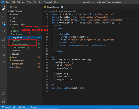
Instead of templates and pages created Screens folder in project. In which created AtomicDesign.js screen for that composed SearchSenderModel.js from organisms and required some text file from atoms for mentioning label.
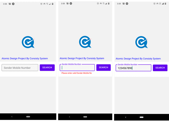
Finally, got the output in which showing text and editbox with button. Applyed error message in red color using Formik and Yup packges by React . Button press event is used to show the error message if input is null or empty and provided input using TextInput. They uses various state , props and styles as per design. Some are used inline and some provides through global contex.